The Basics of Drawing a Baseball Cap
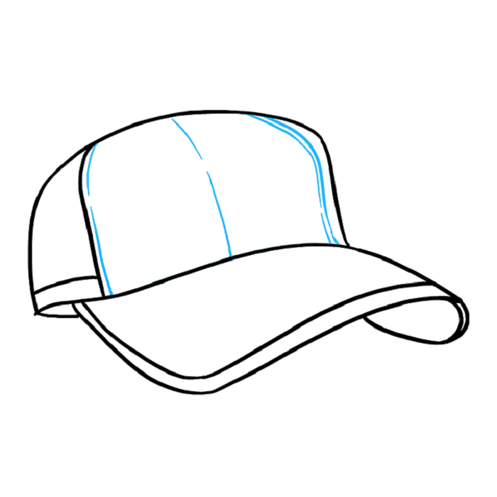
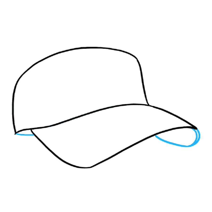
Drawing a baseball cap can be simple and fun. Knowing the basics is key. We’ll cover those here. Look at a real baseball cap. Notice its parts. The crown, bill, and adjuster are the main ones you’ll draw. Begin with a light pencil. Sketch the basic shape of the crown first. It’s usually a dome-like structure. Then, draw an oval for the bill. Ensure it’s in proportion to the crown. Erase mistakes as you go along. Refine your lines once you have the basic shapes down. Add slight curves to the crown’s top to indicate its roundness. Use a darker pencil or pen to outline the final shape. Remember, keep your hand steady. Take your time with each step. Practice makes perfect.
Key Elements of a Baseball Cap Design
When drawing a baseball cap, it’s crucial to capture its defining features accurately. These features make the cap recognizable and give it character. Let’s break down these key elements:
Crown
The crown is the top part of the cap. It often has a round, dome-like shape. Think about the cap’s structure. Most baseball caps have a structured crown with six panels. Each panel forms a section that comes together at the cap’s peak. Draw light lines to mark out each panel. Show where they meet with a small button-like detail at the top.
Bill or Visor
The bill or visor is the flat, protruding part at the front. It’s what shades the wearer’s eyes. Get its curve right. The bill’s edge usually has a slight arc. It should look sturdy and not too thin. Start with an oval shape beneath the crown. Then, refine it into the bill shape. Keep its width and length in proportion to the size of the crown.
Adjuster
The adjuster is at the back. It’s how wearers change the cap’s fit. Some caps have buckles or straps. Others have plastic snaps. Consider which type you’re drawing. Show the adjuster’s position with a line or two. Add the buckle or snaps with small, simple shapes.
The Seam Lines
Seams run from the bill through the crown’s panels. They can be subtle. Include them if they add to your drawing. Seams show the cap’s structure. They can also affect how the cap looks from various angles.
Understanding these key elements is important. When you draw a baseball cap, they help you create a more realistic and recognizable depiction. Keep these in mind as we move onto the next stages of detailing your drawing.

Step-by-Step Guide to Drawing the Cap’s Crown
Let’s start drawing the crown step-by-step. Follow these simple stages to create a realistic crown for your baseball cap.
- Outline the Crown: Begin with a faint outline. Draw a semi-circle for the dome of the crown. This semi-circle should be smooth and even.
- Divide the Crown: Most baseball caps have six panels. Lightly sketch straight lines starting from the cap’s peak to its bottom. These lines create the sections for each panel.
- Refine Panel Lines: Go over the lines again. Make them more visible. Adjust any crooked lines to ensure your crown looks symmetrical.
- Add the Button: Cap off the peak with a small circle. This is where the panels come together. Draw it at the top center of the crown.
- Detail Each Panel: Add slight curvature to each panel line. This shows the cap’s structured design. Keep the curves subtle.
- Erase Unwanted Marks: Clean up your sketch. Remove extra pencil lines. This makes your crown clear and tidy.
- Finalize the Outline: Darken the outline of the crown. Use a darker pencil or ink. This defines the crown and sets it apart from the rest of your drawing.
By following this guide, you know how to draw baseball cap crowns with accuracy. These steps keep your drawing process focused and help you achieve better results. In the next part, we’ll explore techniques for illustrating the bill of the cap.
Illustrating the Bill of the Cap: Techniques and Tips
Moving on from the crown, it’s time to focus on the bill of the baseball cap. The bill, also known as the visor, requires careful attention to detail to ensure it looks realistic and proportionate. Here are some techniques and tips to illustrate the bill effectively:
- Start with the Basic Shape: Begin with an oval shape just beneath the crown’s base. This represents the bill’s top view.
- Define the Curve: Adjust the oval to include a slight curve that represents the bill’s arc. This curve is important for shading the eyes and should appear natural.
- Check Proportions: Compare the bill’s length and width to the crown. Adjust as needed to maintain balance in your drawing.
- Add Thickness: Show the bill’s thickness by drawing a parallel line underneath the curved edge. This creates a 3D effect and gives the bill substance.
- Refine the Edges: Smooth out any jagged lines along the edges. Aim for a clean, crisp outline that accurately represents the bill’s shape.
- Shade for Depth: Use shading to give the bill depth. Highlight where the light hits and shadow under the curve to enhance realism.
- Detail Textures: If the bill has stitching or texture, add these details last. Small dashes can represent stitches, adding to the authenticity of your drawing.
Remember, practice is key to mastering how to draw the baseball cap’s bill. Study real caps to understand the structure and apply these tips to create a believable and stylish drawing.
Adding Details and Texture to Your Baseball Cap Drawing
After you have the basic shapes and elements of the baseball cap down, it’s time to add details and texture to bring your drawing to life. Here are some steps and tips to enhance your depiction of a baseball cap:
- Add the Stitches: Stitches are a key detail on a baseball cap. Use short lines along the edges of the panels and the bill. This adds realism to your drawing.
- Show Fabric Texture: Caps have different textures based on the fabric. For a canvas cap, use tight cross-hatching. This creates a rough texture. For smoother fabrics, keep the shading light and even.
- Draw the Eyelets: Don’t forget the small eyelets on the crown. These are for ventilation. Represent them with tiny circles or ovals, placed evenly around the crown.
- Include the Inner Band: Often overlooked, the inner band helps the cap fit snugly. Draw it just inside the bottom edge of the crown.
- Highlight the Bill’s Undercurve: Many caps have a different color or texture underneath the bill. Show this with shading or a change in texture.
- Create Depth with Shadows: Where the crown meets the bill, add a darker shade. This suggests depth and the overlap of different parts.
Using these steps will make your baseball cap drawing more detailed and textured. Remember to keep practicing. Look at real caps to get a better sense of where to add these finer touches. As you draw, think about the material and the wear the cap might have seen. This guide will take your baseball cap from a flat sketch to a textured, three-dimensional drawing.

Drawing Baseball Caps in Different Perspectives
Drawing baseball caps from varied angles adds depth to your artwork. It showcases how the hat would look on someone’s head from the front, side, or back perspectives. Here’s how to confidently tackle different perspectives:
- Front View: Start with the front view by centering the crown on your page. The bill should be visible just below it. Ensure the crown’s curve matches the head’s shape it would sit on.
- Side View: To draw a side view, focus on the profile of the cap. The crown’s side and the bill’s length will be more evident from this angle. Portray the adjuster if it’s visible from the side.
- 3/4 View: This is the most dynamic view. Combine elements of both front and side views. The bill appears at an angle and only part of the adjuster might show.
- Back View: Illustrating the back view, emphasize on the adjuster. Also, show how the crown encircles the head and tapers down to the adjuster.
- Top View: For the top view, focus on the button and the panels running towards it. The bill is not visible from this angle.
Practice sketching these perspectives to gain a better understanding of the baseball cap’s form. Observe real-life caps as a reference. Doing so will improve your ability to depict the cap naturally.
Changing perspectives is a way to bring variety to your drawings. It also helps you understand the cap’s three-dimensional aspect. Remember, accurate proportion and consistency are key in maintaining realism in different views of your baseball cap drawing. Keep refining your technique, and soon you’ll be adept at showing baseball caps from any angle.
Capturing the Character: Adding Logos and Emblems
Adding logos and emblems can give your baseball cap drawing distinctiveness and personality. It’s a crucial step to make your cap stand out. Here’s a simple guide on how to add these elements effectively:
- Choose the Right Spot: Logos usually sit on the front panel of the cap. Choose a spot that is center and visible.
- Sketch Out the Logo: Start with a light sketch. Use basic shapes to outline the logo’s form. This helps you position it correctly.
- Refine the Outline: Once you have the basic shapes, refine the edges. Adjust the size to fit the cap’s panel and maintain proportions.
- Add Details Gradually: Work from larger elements to finer details. Avoid rushing this step. Careful detailing will add to the logo’s impact.
- Consider the Emblem’s Style: Whether the logo is bold, intricate, or simple, match your drawing style to it. This keeps your drawing consistent.
- Use Contrast: Make the logo stand out with contrast. Use dark lines on light fabric, and vice versa.
- Be Mindful of Angles: If drawing the cap from a different perspective, warp the logo accordingly. It should follow the cap’s curvature.
Adding logos and emblems is about precision and attention to detail. Practice drawing various types of logos. This will make you more versatile in how to draw baseball cap designs with character. Remember to look at actual caps for reference to get the logo’s look just right.

Common Mistakes to Avoid When Drawing Baseball Caps
Drawing a baseball cap accurately involves attention to detail and an understanding of proportions. However, many beginners and even seasoned artists can make common mistakes that can affect the realism and appeal of their baseball cap drawings. Here are some pitfalls to avoid:
- Incorrect Proportions: One of the most frequent errors is getting the proportions wrong. The bill should not be too long or too wide compared to the crown. Always check the size ratio between different parts of the cap.
- Flat Appearance: Many drawings lack depth, making the cap look flat. Be sure to add shading and highlights to give the cap a three-dimensional look.
- Ignoring the Curve of the Bill: The bill must curve naturally. A straight or poorly curved bill can ruin the overall effect of your drawing.
- Overlooking the Back Adjuster: Some artists forget to include the adjuster at the back of the cap. This is a key element, especially in a rear view.
- Misplacing Logos or Emblems: Position logos carefully. Placing a logo too high, too low, or off-center can make the cap look unrealistic.
- Inconsistent Seam Lines: Seam lines should be consistent and symmetrical. Uneven seams can make the baseball cap look distorted.
- Ignoring Fabric Texture: Different materials have different textures. Neglecting to show the texture can make the cap appear too smooth or generic.
By avoiding these common errors, you can enhance the realism and attractiveness of your baseball cap drawings. Remember, observing real baseball caps can provide great insights into how to draw them accurately. Keep practicing, and adjust your techniques based on what you learn from each drawing attempt.
